
Typography is crucial in design because it enhances readability and influences the viewer’s perception. Effective typography communicates the message clearly and aesthetically.
Typography plays a vital role in design, impacting how content is perceived and understood. It involves selecting fonts, sizes, spacing, and colours that align with the design’s purpose and audience. Good typography ensures that text is readable and visually appealing, making the content more engaging.
Consistent use of typography builds brand identity and trust. Through thoughtful typographic choices, designers can evoke emotions and guide user experience. Investing in quality typography can significantly improve the effectiveness of a design, making it not just about aesthetics but also about communication. Proper typography is essential for any design project aiming for clarity, coherence, and impact.
The role of typography in design
Typography plays a crucial role in design. It goes beyond just choosing fonts. The right typography can elevate a design, making it more engaging and effective. It impacts readability, user experience, and even emotions. Let’s explore why typography is so important in design.
Impact on user experience (UX)
The impact of typography on user experience is substantial. Good typography ensures readability and accessibility. Users can easily read and understand the content. This keeps them on the website longer.
Several factors influence the impact of typography on user experience:
- Font Size: Large fonts are easier to read. Small fonts can strain the eyes.
- Line Height: Proper spacing between lines improves readability.
- Contrast: High contrast between text and background enhances legibility.
- Font Choice: Serif fonts are traditional. Sans-serif fonts are modern and clean.
Let’s look at a table summarizing these factors:
| Factor | Impact |
|---|---|
| Font Size | Large fonts improve readability |
| Line Height | Proper spacing makes text easier to read |
| Contrast | High contrast enhances legibility |
| Font Choice | Different fonts convey different emotions |
Using the right typography can make your website more user-friendly. It keeps users engaged and ensures they have a pleasant experience.
Setting the tone
Typography sets the tone for your design. Different fonts evoke different emotions. They can make a design feel formal, casual, playful, or serious. Choosing the right font is essential for conveying your message effectively.
Here are some ways typography sets the tone:
- Serif Fonts: These fonts have small lines at the ends of characters. They look traditional and formal. Examples include Times New Roman and Georgia.
- Sans-Serif Fonts: These fonts do not have lines at the ends of characters. They look modern and clean. Examples include Arial and Helvetica.
- Script Fonts: These fonts look like handwriting. They are elegant and decorative. Examples include Brush Script and Pacifico.
- Display Fonts: These fonts are bold and unique. They are great for headlines and logos. Examples include Impact and Comic Sans.
Choosing the right font helps communicate the intended message effectively. It aligns the design with the brand’s personality. The tone set by typography can influence how users perceive your content.
Typography is a powerful tool in design. It impacts user experience and sets the tone. Choosing the right typography can make your design more effective and engaging.
Psychological effects of typography
Typography is also pivotal in enhancing readability and effectively conveying emotions and messages. Its psychological effects are profound. Different fonts, sizes, and styles can evoke various feelings and thoughts in the reader. Understanding these effects helps designers create more impactful and engaging content.
Emotional response
Fonts can evoke specific emotions. For instance, a serif font like Times New Roman feels traditional and reliable. In contrast, a sans-serif font like Arial appears modern and clean. Here are some examples:
- Serif Fonts: Trustworthy, formal, and professional.
- Sans-Serif Fonts: Modern, clean, and straightforward.
- Script Fonts: Elegant, personal, and creative.
- Display Fonts: Bold, attention-grabbing, and impactful.
Colour also influences emotions. Warm colours like red and orange can energize and excite, while cool colours like blue and green can calm and soothe. The combination of font style and colour plays a significant role in creating the desired emotional response.
Here is a table illustrating common emotional responses to fonts:
| Font Type | Emotional Response |
|---|---|
| Serif | Trustworthy, Formal |
| Sans-Serif | Modern, Clean |
| Script | Elegant, Personal |
| Display | Bold, Impactful |
Cognitive influence
Typography affects how we process information. Clear and readable fonts help readers understand and retain content better. Fonts that are difficult to read can hinder comprehension and cause frustration. Here are some key points:
- Readability: Simple fonts like Arial or Helvetica improve readability.
- Font Size: Larger fonts are easier to read and understand.
- Line Spacing: Proper spacing between lines helps in better comprehension.
- Contrast: High contrast between text and background enhances readability.
Typography can also impact the reader’s attention span. Engaging fonts and proper formatting keep readers interested. Long blocks of text can overwhelm readers. Breaking text into smaller paragraphs or using bullet points can make content more digestible.
Typography is a powerful tool in design. It not only conveys the message but also shapes how readers feel and think. Understanding its psychological effects can lead to more effective and engaging designs.
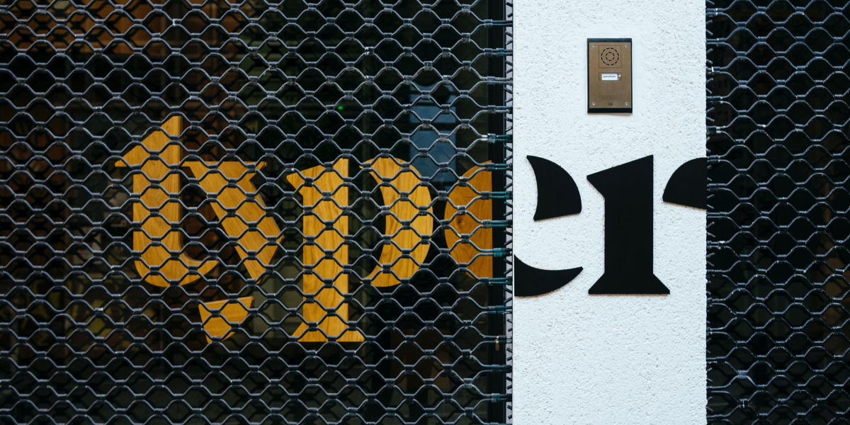
Typography in branding
Typography shapes how people see and feel about brands. It goes beyond just picking a pretty font. It’s about making a statement. Typography in branding is key to creating a unique look and feel for any brand.
Creating brand identity
Typography helps to create a strong brand identity. It sets the tone for how a brand communicates with its audience. The right font can convey feelings of trust, excitement, or even luxury. Here are some ways typography shapes brand identity:
- Font Choice: Serif fonts are often seen as traditional and trustworthy. Sans-serif fonts appear modern and clean.
- Consistency: Using the same fonts across all materials helps create a cohesive look.
- Readability: Easy-to-read fonts ensure that the brand’s message is clear and accessible.
Choosing the right typography involves several factors. A brand targeting children might use playful, rounded fonts. A luxury brand might opt for elegant, thin fonts. Here’s a simple table to showcase different font choices:
| Brand Type | Font Style |
|---|---|
| Children’s Toys | Playful, Rounded |
| Luxury Goods | Elegant, Thin |
| Tech Startups | Modern, Clean |
These choices help brands stand out in a crowded market. A consistent and thoughtful typography style builds a strong brand identity.
Building brand recognition
Typography also plays a vital role in building brand recognition. People often remember a brand by its visual elements. Fonts can become iconic and instantly recognizable. Here’s how typography aids brand recognition:
- Unique Fonts: Custom or unique fonts can make a brand instantly recognizable.
- Logo Design: Typography in a logo can set the brand apart from competitors.
- Marketing Materials: Consistent use of typography in ads, brochures, and websites reinforces brand recognition.
Let’s take a look at some famous brands and their typography:
| Brand | Typography Style |
|---|---|
| Coca-Cola | Script, Classic |
| Sans-serif, Simple | |
| Disney | Playful, Unique |
These brands use typography to create strong visual identities. Their fonts are part of what makes them memorable. Consistency in typography across all platforms ensures that the brand stays in the minds of consumers. Thus, typography is essential for building and maintaining brand recognition.
Typography trends in design
Typography is more than just letters on a page. It breathes life into design, creating mood, context, and readability. Typography trends in design shape how we perceive and interact with content. Staying updated with these trends ensures that your design remains fresh and engaging.
Minimalist typography
Minimalist typography focuses on simplicity and clarity. It uses clean, straightforward fonts to create an uncluttered look. This style emphasizes readability and elegance.
Key features of minimalist typography include:
- Simple Fonts: Sans-serif fonts like Arial and Helvetica are popular.
- Ample White Space: Generous spacing helps highlight the text.
- Limited Color Palette: Often uses black, white, and a few accent colours.
Minimalist typography works well in various design contexts:
| Context | Why It Works |
|---|---|
| Web Design | Enhances user experience by making content easy to read. |
| Print Media | Creates a sophisticated and professional appearance. |
| Branding | Helps in establishing a clean and modern brand identity. |
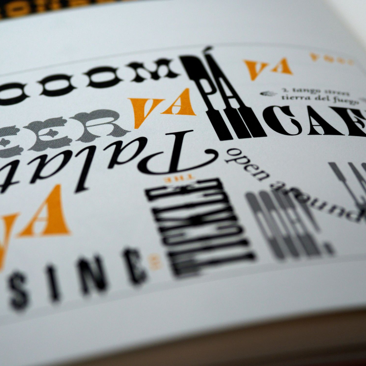
Experimental typography
Experimental typography breaks the norms. It uses unconventional fonts and layouts to create unique and eye-catching designs.
Key features of experimental typography include:
- Bold Font Choices: Uses unusual and artistic fonts.
- Creative Layouts: Text may be arranged in non-linear ways.
- Dynamic Colours: Often employs bright and contrasting colours.
Experimental typography is ideal for:
| Context | Why It Works |
|---|---|
| Advertising | Grabs attention and creates memorable ads. |
| Posters | Makes posters stand out and convey messages creatively. |
| Digital Art | Allows for artistic expression and innovation. |
Experimenting with typography can lead to groundbreaking designs that captivate audiences.
The intersection of typography and technology
The way text looks can affect readability and user experience. As technology evolves, so does typography. The intersection of typography and technology has brought new tools and methods to enhance design.
Responsive typography
Responsive typography adjusts to different screen sizes. This ensures that text remains readable on any device. Imagine reading a tiny text on a smartphone; it’s difficult and frustrating. Responsive typography solves this problem.
Here are some benefits of responsive typography:
- Improved readability: Text adjusts to fit the screen size.
- Better user experience: Users can read content comfortably on any device.
- Consistent design: Maintains design integrity across various devices.
Implementing responsive typography involves using CSS techniques. Media queries and flexible units like ems and rems are essential. Here’s a simple example of responsive typography using CSS:
  @media (max-width: 600px) {

    body {

      font-size: 14px;

    }

  }
@media (min-width: 601px) {
body {
font-size: 18px;
}
}
This code adjusts the font size based on screen width. Responsive typography ensures that your design looks great everywhere.
Variable fonts
Variable fonts are a game-changer in typography. A single variable font file can include multiple styles. This reduces the number of font files you need to load. It makes web pages load faster.
Benefits of variable fonts include:
- Flexibility: One file can contain various weights and styles.
- Performance: Reduces the number of HTTP requests.
- Design freedom: Allows for more creative control.
Here’s an example of how to use a variable font in CSS:
  @font-face {

    font-family: 'MyVariableFont';

    src: url('MyVariableFont.woff2') format('woff2');

    font-weight: 100 900;

  }
body {
font-family: ‘MyVariableFont’, sans-serif;
font-weight: 400;
}
This code defines a variable font with weights from 100 to 900. Variable fonts make typography more efficient and versatile.
Best practices for typography in web design
Typography is particularly foundational within the digital realm. The way text is presented can significantly impact user experience and engagement. By following best practices for typography in web design, you can ensure your content is not only visually appealing but also accessible and easy to read. Let’s explore key aspects to consider for effective web typography.
Readability and accessibility
Ensuring readability and accessibility is vital for web typography. Good typography allows users to read content without straining their eyes. Here are some best practices:
- Font Size: Use a font size of at least 16px for body text. Larger text improves readability.
- Line Height: Set line height to 1.5 times the font size. This creates enough space between lines, enhancing readability.
- Font Choice: Choose fonts that are clear and legible. Avoid overly decorative fonts for body text.
- Colour Contrast: Ensure high contrast between text and background. This is crucial for users with visual impairments.
Consider the following table for optimal font sizes and line heights:
| Element | Font Size | Line Height |
|---|---|---|
| Body Text | 16px | 1.5 |
| Headings (H1) | 32px | 1.2 |
| Headings (H2) | 24px | 1.3 |
Hierarchy and alignment
Hierarchy and alignment guide users through your content. They highlight important information and create a structured layout. Here are some best practices:
- Visual Hierarchy: Use different font sizes and weights to create a visual hierarchy. Headlines should be larger and bolder than body text.
- Consistent Alignment: Align text consistently. Left-aligned text is the most readable for most users.
- Whitespace: Use whitespace effectively. It separates different sections and makes the content easier to scan.
Consider this example for a well-structured layout:
Main heading
Subheading 1
Body text for subheading 1.
Subheading 2
Body text for subheading 2.
Alignment can also impact readability. Avoid justified text; it can create uneven spacing between words. Use left alignment for most text blocks.
By applying these best practices, you ensure your web content is both engaging and user-friendly. This leads to a better user experience and higher engagement rates.
Typography in print vs. digital design
Typography influences how people perceive and interact with content. Typography in print and digital design has unique challenges and opportunities. Understanding these differences helps designers create more effective and engaging visuals.
Challenges of print typography
Print typography presents several challenges. Designers must carefully choose fonts and layouts since printed materials are static and cannot be easily altered. Here are some specific challenges:
- Font Choices: Limited to fonts that print well.
- Colour Consistency: Colours may appear different on paper than on screen.
- Readability: Must ensure that text is readable at various sizes.
- Paper Quality: Different paper types can affect how text appears.
These factors make print typography a complex task. Designers often create multiple drafts and conduct tests to ensure the final product meets the desired standards. Consider the following table that compares some key aspects:
| Aspect | Print Typography |
|---|---|
| Font Selection | Limited to print-safe fonts |
| Colour | May vary due to ink and paper |
| Readability | Fixed and must work at all sizes |
| Editing | Difficult once printed |
Adaptability in digital design
Digital design offers more flexibility and adaptability than print. Designers can use a wider range of fonts and colours. Here are some benefits of digital typography:
- Font Variety: Access to numerous web-safe fonts.
- Colour Accuracy: Consistent colours across different screens.
- Responsive Design: Text can adjust to various screen sizes.
- Interactivity: Include links and dynamic elements.
Digital design allows for real-time changes. Designers can update text and layouts quickly. This adaptability makes it easier to maintain and improve the user experience. The following table highlights some key advantages:
| Aspect | Digital Typography |
|---|---|
| Font Selection | Extensive with web-safe options |
| Colour | Consistent across screens |
| Readability | Adjustable for different devices |
| Editing | Easy and instant updates |
Embracing the adaptability of digital design helps create a better user experience. It allows for continuous improvement and responsiveness to user needs.
Future of typography in design
Typography helps convey messages effectively, enhancing readability and user experience. The future of typography in design promises exciting advancements. Designers can look forward to new innovations and greater customization.
Innovations in typeface design
Innovations in typeface design are reshaping the design world. Designers now have access to a wide range of typefaces. These typefaces are more versatile and adaptable than ever before.
- Variable Fonts: Variable fonts allow for multiple weights and styles within a single font file. This reduces load times and increases flexibility.
- Responsive Typography: Typography that adapts to different screen sizes. This ensures readability across devices.
- Augmented Reality (AR) Typography: AR brings text to life. It creates interactive experiences for users.
Advancements in AI also impact typeface design. AI can help create custom fonts quickly. This opens up new possibilities for designers.
| Innovation | Benefit |
|---|---|
| Variable Fonts | Flexibility and reduced load times |
| Responsive Typography | Ensures readability on all devices |
| AR Typography | Creates interactive experiences |
Personalization and customization
Personalization and customization in typography are growing trends. Designers can create unique experiences for users. Custom fonts and personalized text make designs stand out.
Custom Fonts: Brands now create their own fonts, which helps with brand recognition and consistency and reflects a brand’s personality.
Dynamic Text: Dynamic text adapts to user behaviour, providing a personalized experience that keeps users engaged.
- User Preferences: Typography can be adjusted based on user preferences. This includes font size, style, and colour.
- Data-Driven Design: Designers use data to create personalized typography. This enhances user engagement and satisfaction.
- Interactive Fonts: Interactive fonts respond to user actions. This creates a more immersive experience.
Personalization and customization make typography more relevant. They create a unique and engaging user experience.
Frequently asked questions
What is the most important aspect of typography in a design?
Legibility is the most important aspect of typography in design. It ensures that text is easy to read and understand.
How can Typography Influence Design Decisions?
Typography impacts design by setting the tone and enhancing readability. It influences user experience and brand perception. Proper font choices can attract attention and convey emotions. Consistent typography strengthens brand identity, while poor choices can confuse and disengage users. Effective typography supports overall design harmony.
What are the effects of typography?
Typography affects readability, user experience, and brand perception. Good typography enhances engagement, while poor typography can deter readers.
What are the five principles of typography?
The five principles of typography are contrast, hierarchy, alignment, balance, and space. Contrast makes text readable. Hierarchy guides the reader. Alignment creates order. Balance ensures visual stability. Space enhances clarity.
Remember, effective design starts with well-chosen typography. Make your content visually appealing and impactful through strategic typography use.